|
| Author |
Message |
|
jeanf
|
Post subject: Re: Logo development  Posted: Posted: Sun Jun 16, 2013 3:39 pm |
|
Joined: Mon Jun 07, 2010 8:41 pm
Posts: 1884
Location: Near Toronto, Ontario, Canada
|
|
Josh, I can see what you mean, I think it's the font. ? But probably not an issue as this logo would appear with other text like "most awesome chef/caterer ever" and "don't hire me if you want your food to suck"
Anyway in a colour other than gold/yellow I wouldn't think of the golden arches. Logo choices are hard!
|
|
| Top |
|
 |
|
Cubangirl
|
Post subject: Re: Logo development Posted: Mon Jun 17, 2013 1:14 am |
|
Joined: Sat Nov 12, 2011 8:05 pm
Posts: 1191
Location: Chico, CA
|
|
I get modern and sleek first, but also golden arches and Chinese food vibe. Can you have just Cuisine under the AH? I think that would make it less likely to get the Chinese vibe. So is the color more of an orange?
I do a lot of surveys and often they are on new product concepts and logos. I find that my first impression tends to prevail regardless of second looks. I still like the architecture of the logo, even if the color is not my fave. FWIW, I keep seeing a green which is weird because I am not green person.
_________________
Alina
|
|
| Top |
|
|
|
Tatoosh
|
Post subject: Re: Logo development Posted: Mon Jun 17, 2013 3:06 am |
|
Joined: Thu Mar 31, 2011 6:55 am
Posts: 516
Location: Cordillera, Luzon, Philippines
|
Lami-AH! which is "very tasty" in Cebuano. I like it. 
_________________
Tatoosh aka Steve
Ancient Amerikano Adventuring Abroad: another fat guy up a mountain in the Philippines
|
|
| Top |
|
|
|
fitzie
|
Post subject: Re: Logo development Posted: Mon Jun 17, 2013 5:19 am |
|
Joined: Fri Dec 19, 2008 9:52 am
Posts: 1140
Location: Kansas City
|
|
I like the logo very much. I think the color is fine although I'd prefer a more intense shade, say International Orange That's just personal.
Question: how are you going to pronounce the name - "Ah" as in a sigh of satisfaction or "A. Aitch"? Just curious.
|
|
| Top |
|
|
|
Da Bull Man
|
Post subject: Re: Logo development Posted: Mon Jun 17, 2013 10:56 am |
|
Joined: Fri Dec 19, 2008 11:21 am
Posts: 1403
Location: Six Shooter Junction, Texas
|
|
I have always preferred AH over WOW...I would outline the letters just so they would jump out a little more...I like...
_________________
To do is to be [Descartes] To be is to do [Voltaire] Do be do be do [Sinatra].
|
|
| Top |
|
|
|
ldkelley
|
Post subject: Re: Logo development Posted: Mon Jun 17, 2013 10:56 am |
|
Joined: Tue Dec 23, 2008 8:06 pm
Posts: 935
|
|
I like the font and the proportions. Line art is good because you can use it in many applications and it will scale to infinity.
I also read it as "Ah... cuisine" and I am not sure that is what you are going for.
Two color artwork is good as it is cheaper for printed applications from business cards to shirts.
I like the burnt yellow color, but it doesn't shout "food" or "yum" to me.
Good luck!
--Lisa
|
|
| Top |
|
|
|
Amy
|
Post subject: Re: Logo development Posted: Tue Jul 02, 2013 11:52 am |
|
Joined: Thu Dec 18, 2008 7:37 pm
Posts: 3404
Location: Telluride, CO
|
Latest iterations...thoughts? 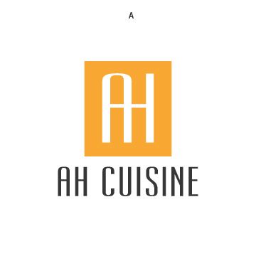 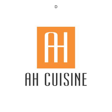 The difference between the two is subtle color shifts, but as you will also see the logo is now reversed and the name of business is more prominent. Would love your feedback. In case you can't tell, I love orange for the logo, but am not married to it if you're still reading it as gold, which I don't want. Amy
|
|
| Top |
|
|
|
JesBelle
|
Post subject: Re: Logo development Posted: Tue Jul 02, 2013 1:55 pm |
|
Joined: Fri Jan 16, 2009 7:50 pm
Posts: 2062
|
|
| Top |
|
|
|
fitzie
|
Post subject: Re: Logo development Posted: Tue Jul 02, 2013 2:31 pm |
|
Joined: Fri Dec 19, 2008 9:52 am
Posts: 1140
Location: Kansas City
|
|
Definitely looks orange to me. I like it and the new composition as well.
fitzie
|
|
| Top |
|
|
|
beccaporter
|
Post subject: Re: Logo development Posted: Tue Jul 02, 2013 2:44 pm |
|
Joined: Sun Dec 21, 2008 10:34 am
Posts: 419
Location: Northeast Louisiana
|
|
Love D.
_________________
-Becca
|
|
| Top |
|
|
Who is online |
Users browsing this forum: No registered users and 6 guests |
|
You cannot post new topics in this forum
You cannot reply to topics in this forum
You cannot edit your posts in this forum
You cannot delete your posts in this forum
You cannot post attachments in this forum
|

|
|


